I love mornings - they’re the best time of the day.
As a new day starts, all is possible, nothing has yet been decided.
Nature hums with unspoken anticipation - tension and potential bound up in stillness.
I also love sunrises - you get to lay claim to one bookend of the day,
and if seeing it being born doesn’t allow you to sieze it, I can’t imagine what could.
For several years I had the idea of trying to build a webpage that would capture my
love for this moment - I knew it would be V4 of my website, and would soften my dated V3 de-stijl aesthetic.
I wanted it to feel like Cory Wong’s “Trail Songs” Albums, both Daybreak and Dusk.
I tinkered around with building gradients by hand in Inkscape (
an SVG editor). I tried to build an algorithm for simulating a sunrise based off of photonic refraction
for Abound. But I came up dry. I could never get the colors right by eye - even when
I was sampling from an image of a sunrise, the colors always felt either sterile or
gaudy. I realized that to emulate the real thing I needed data from the real thing.
I needed to get a timelapse of the sky on the morning of a perfect sunrise.
Data
It took me four tries. Three times I found myself up before
dawn, perched somewhere in the foothills in Colordao, looking westward into the black.
But the sunrise is tricky - you have to get up far before Astronomical Twilight to get in
position in order to catch it from black (which nescessarily implies doing so on a non-work day) -
you have to have a timelapse setup that isn’t too shaky - and critically, you get at
most one shot per day. I messed up the timelapse setup one time when my camera blew over from a gust on top of Berthoud pass.
But the problem that thwarted me twice was clouds. Clouds are tricky. They
totally skew the data on colors because they introduce huge dips in saturation and
skew toward bluer hues even at sunrise. They’re also ubiquitious.
If you look out to the horizon from a high vantage, only very rarely will there
truly be no clouds in the sky. When visibility is good, you need sometimes hundreds
of miles of clear sky in front of you to fully capture the color of the true horizon
during a sunrise. Twice I found myself thwarted in the wee hours of the morning by
clouds.
But then, the day before Junteenth 2025 (the Federal holiday most worthy of celebration for other reasons)
the cloud cover forecast on Open Snow indicated the holiday might be perfect.
- I set an alarm for 12:55 AM.
- I packed a bag and hit the road by 1:30 AM.
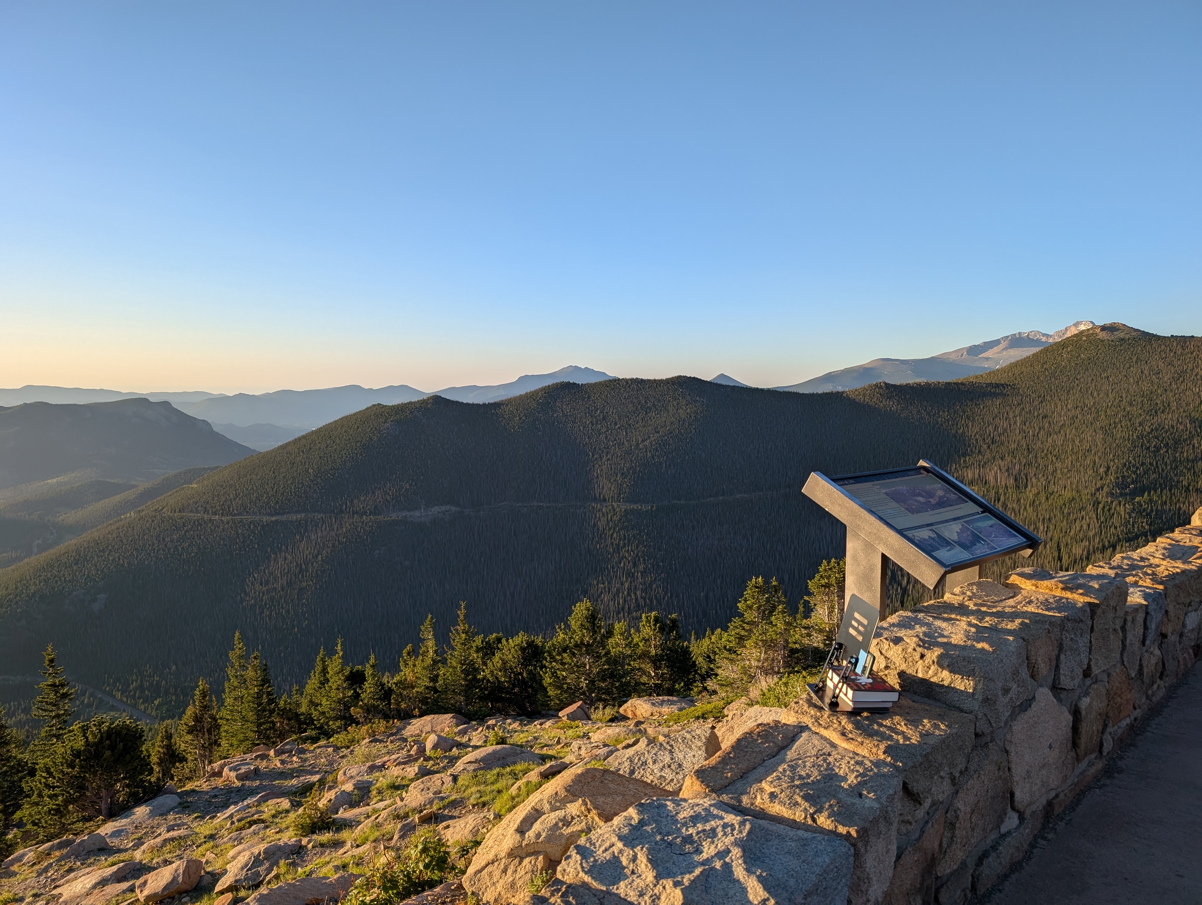
- By 2:30AM I reached Rocky Mountain National Park, and was briefly delayed because none of their automated payment machines were working (sorry for not paying NPS, I tried).
- By 3:10AM I was in position at Rainbow Curve on Trail Ridge Road. I setup the ersatz tripod (a laptop stand with a phone ductaped to it, reinforced by books), using the direction of the crescent on the moon to point toward the sun, which was coming from the northwest, instead of the west as I’d planned. Rainbow Curve points due west through the foothills, which is why I chose it, but this meant the sunrise would happen over the mountains.
- I went to sleep in my car at 3:30 AM, and fitfully slept through howling winds until 6:30, when I crawled out of my car to bask in the warm glow of morning (the best time of the day).
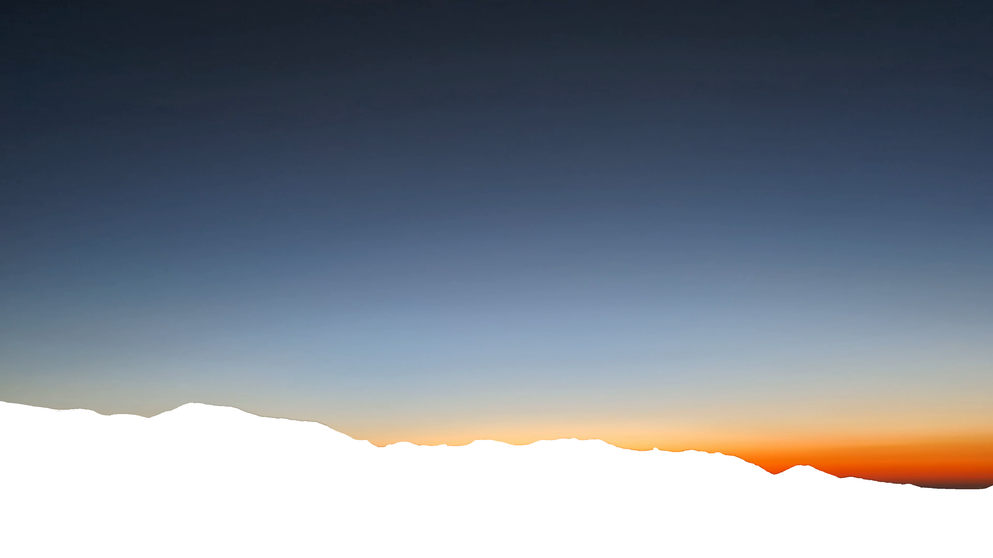
The timelapse was perfect - you can see it here.
Building the Gradient
I got to work a few days later trying to build the CSS that could replicate the perfection of that video.
First, I used Google Photos to stabilize the result, which made subsequent analysis much easier.
Then, I created a mask which only included the sky (by hand in GIMP), and ran a bash script
to extract each frame of the image and apply that mask to it. I also put any of the frames
that happened after the sun poked over the horizon into a different folder. I had quickly realized it was going to be
hard to solve both the pre-and-post sunrise with the same algorithm.
Using the data to create the output ended up being relatively simple, it took about 4-8h total.
Using Claude Code I tried out 4-5 different algorithms that I’d sketched out before to try to
achieve the subtle curvature you see in sunrises, including:
- Using Iso-Color bands to try to identify the center of a radial gradient based on curvature
- Using a loss function (of comparison with an orginal frame) to try to come up with an idealized gradient for each frame
- Using a vertical color sample from the middle and edges of the image to estimate the eccentricity and center of an elipse we could use as a radial gradient.
All of these proved not effective, and while I got some fun failure modes, I didn’t feel like I was getting much closer.

But the more I played around with it, the more it felt like maybe a linear gradient (a far simpler approach)
could be sufficient - I realized that if you add a foreground of mountains, you don’t mind the ways the light doesn’t
bend as much near the horizon.
So the actual algorithm is dead simple: In each frame F, select N rows evenly spaced through the frame (final result uses N = 30). For each row R, average the color of every pixel in the row. This gives you an F-by-N matrix with a single color value for each cell (Row). This matrix just is tehn your keyframes for the resulting linear gradient (with F being the keyframe steps). Super simple!
There are only two additional effects I added after that basic algorithm. The first was recognizing that the
sampling of individual rows meant that the matrix it generated wasn’t “smooth” - both in the time
dimension and in the vertical dimension there was a lot of “roughness” in that the colors would jitter about
and you could see the bands clearly at keyframes. I solved this through the standard box blurring algorithm (applied to the breakpoint colors, not the pixels!) - just
average each breakpoint within each keyframe value with the 8 adjacent values in the matrix (2 in the same frame, 3 in the next and 3 in the prev).
This reduced the amount of noise dramatically.
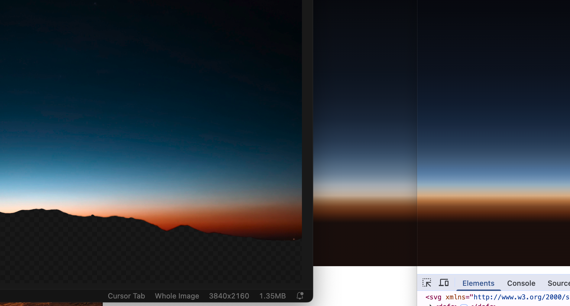
The second realization was that averaging RGB values yields colors that tend toward greys - (visualize the
3-space of the RGB cube to reason about why). HSL on the other hand doesnt suffer from this proprety (because it’s conical), so I converted
the logic to average based on HSL, and that dramatically improved the color fidelity. In the image below,
the still frame from the video is on the left, the RGB averaged image is in the center, and the HSL averaged image (no other changes)
is on the right - what a difference that makes eh!?
After figuring that out, it was just the small matter of tricking CSS into being willing to render an animated gradient,
because all the specs will tell you
linear gradients aren't animatable. Because of this I started out by using SVG
animations, which worked great, but wasn’t easy to pause or replay using Javascript, and that felt really important to build.
Well, it turns out if you use CSS’
@property declarations with type color, and then animate
all of the properties that impact the linear gradient in the same set of keyframes,
CSS is willing to render a linear gradient as if it is animated. Many thanks to
Temani Afif for this very nifty hack.
One big disclosure I need to make about this project is that I didn’t write much code for it - mostly just tweaking algorithms
and figuring out the ultimate site layout.
Though I described how they should work, Claude
built all of the
algorithms in several thousand lines of Golang without much assistance. If I had to build it from scratch myself, building the image processing toolkit
would have taken me much more time and I would have had many more bugs than if I hadn’t relied on Claude (though, Claude still had 3-5 critical bugs that required me to dive deep and understand its code).
As a result, the site was quick to build, and I think it looks really nice, but under the hood it’s quite grotesque - code that
carries the scars of dozens of substantial revisions by multiple authors (me and Claude) without much continuity of thought. An instructive co-programming session.
The End Result
I like it so much it’s my new homepage. I like watching it. It feels thoughtful - not overdone, not sloppy.
I have a list of things I’d like to try to get working in the future, including a true radial gradient
(in particular to capture the 3-5 second range of the original video here), getting the same view later in the year
(when the sun will rise in the gap in the mountains instead of over them), and trying a different angle/vantage
to capture the impact of alpenglow on the atmosphere.
I feel ambivalent making this my new homepage - I really liked the old site, and I haven’t yet had a good
idea on how to translate the sunrise theme through to these project pages.
But this is good for now. The day is young and there is much to do!